Tuesday, 28 January 2014

Marion Smith or Graphic 45 ?

For this month's gallery I chose a mix of Graphic 45 and Marion Smith Designs to work with.
I've made projects with both papers and just couldn't decide which one to feature in this blog post....so as there have been a couple of Marion Smith designs lately I decided to go with another Graphic 45 layout


I used one of the latest releases - Couture which you can find in the shop here 

I did some fussy cutting and layered the flowers round the photo. On the top right hand corner I stamped with the Couture lacy stamp and used the tiny corner flourish stamp up the side of the photo and in the left corner.

These papers are gorgeous and have a great mix of colours as always, together with lots of stickers and chipboards to match.Although they are quite girlie  papers they can be adapted for boys too !

Sunday, 26 January 2014

Cards on Sunday - Project Life Saved Me!

Picture the scene, we have wrapped the gift, Olivia is in her Cinderella dress and ready to head out to the Princess party she is off to. I say "Let's pick a card out of the box and write it..." (I keep a box of cards, some handmade and some shop bought) we go to the box and uh oh, there are adult birthday cards, boy birthday cards, sympathy cards, get well cards but not a single thing suitable for a girls birthday!

We had approx. 10 mins before we were leaving, no open shops on the way and no card!

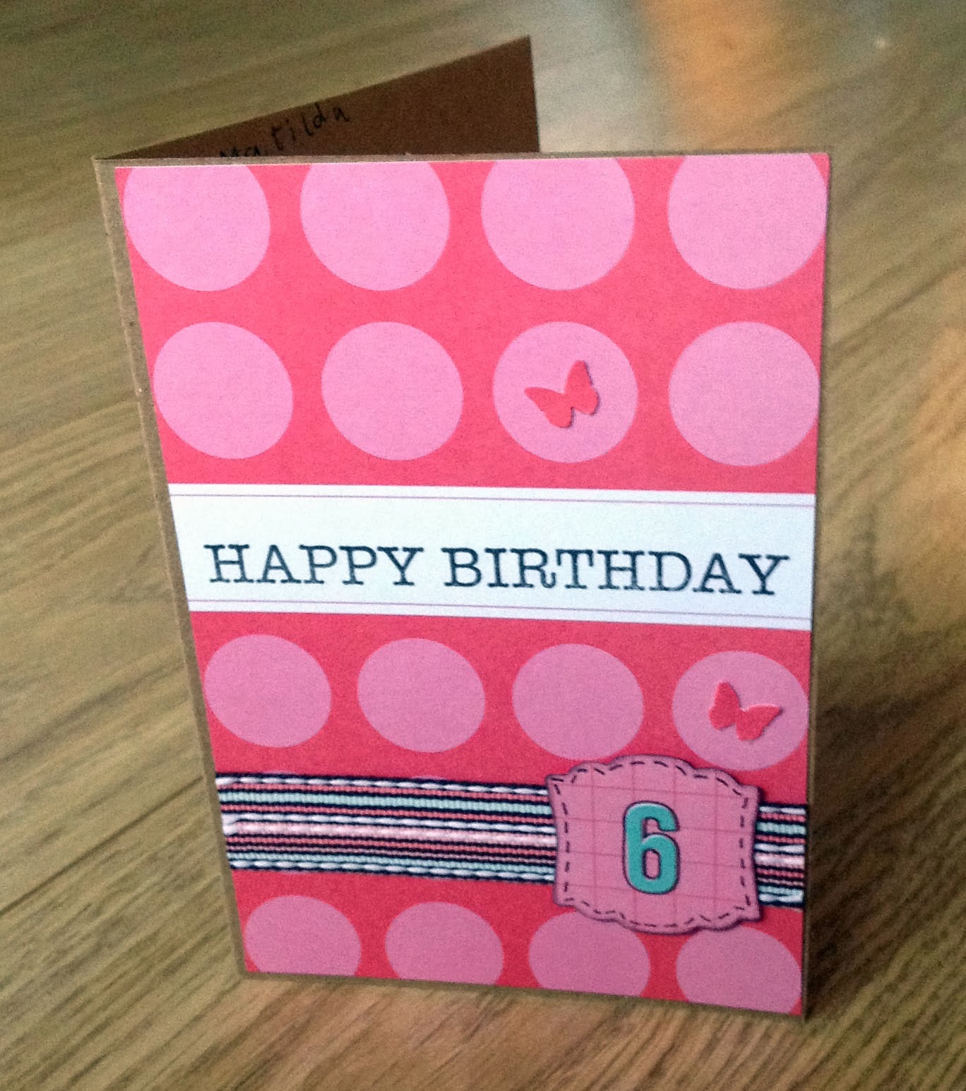
So in a moment of inspiration I fish out my box of Project Life cards. Find a 6x4 card in pink and red as a background. Stamp "Happy Birthday" on it. The quick addition of a length of ribbon, a punched shape with a number 6 on it and some little punched butterflies provides us with the quickest birthday card I have ever made!

 
It won't win any prizes, but in an emergency I was glad of those Project Life cards!

Friday, 24 January 2014

Some more Marion Smith...


When Mel and Jill said we could choose, high up my list of new papers to try was some of the Marion Smith ones.  I love that she has a really good mix of boyish or girlish papers in her collection, so I selected a mixture of the blue and more male ones - I used the Nirvana collection.  If you haven't checked out Jane's beautiful balloon using some of these papers then check out here post here.

I started by working out where I wanted my photo and the papers, and once I was happy with that I then added a layer of gesso, using a palette knife behind where my paper was going.  Once this had dried I made a puddle of brown cosmic shimmer mist and let this drip down the paper.  I distressed all my papers, and cut out some tickets and made a pocket for one of the journalling cards behind the photo - that is another really stand out feature of her papers - she has lots of element sheets where you can cut out all sorts of lovely vintageness or just use the beautiful pattern on the other side.  I added lots of strips of the different papers, and a few of the 7 gypsies gears to the side of the photo, and some prima lace to add a different texture too.


Tuesday, 21 January 2014

Marion Smith

For my designers choice January kit I think I probably surprised everyone by not picking Graphic 45! Instead I went with a paper designer I have never used before - Marion Smith.
She has three new paper ranges out at the moment, Garment District, Mad Tea Party and Nirvana which are available in the shop.
I decided to go for the Nirvana papers, I was attracted by the colour palette and the vintage feel of the artwork then when the papers arrived I really liked the quality and feel of the paper.


To me the papers had a bit of a steampunk feel to them and I was inspired by the hot air balloon on the up and away paper, so I altered a box from some chocolates I had at Christmas...step one, buy and eat a box of these - they are delicious!!
For the balloon I used a polystyrene ball which I covered in distressed Nirvana papers. I used some 'rusty wire' to join the balloon to the top of a champagne cork which was my 'balloon basket' and I added an old cog from my metal bits and pieces collection to make the 'burner'.
I covered the box with Up and Away paper and Decorated with Typography paper and elements from the Documented paper as well as some Prima flowers, Tim Holtz film and butterflies punched from the Marion Smith Papers and some scraps of Authentique paper. The wooden clock and the brass cog were from my stash (not sure of the manufacturers). I finished off by distressing with lots of walnut stain ink and added the 'dare to be original' phrase which was made from left over stickers from Mel's Authentique retreat class.
Here is my finished altered box...


Wednesday, 15 January 2014

Family Stories by Teresa Collins

Ann here today sharing a couple of layouts created for the January gallery. Like Karen I too get just a little excited when Mel and Jill indulge their design team with free choice on what we want to create with.  This was the case in December where we could select which products we wanted to create with for the galleryblog and Facebook page (ATDML #Create) in January.

I had my eye on this paper collection from Teresa Collins for a little while and knew I could make many layouts by just finding complimentary cardstock from within my (vast) existing stock!  Also there are so many great colours in the collection I knew I'd have no trouble find embellishments to coordinate too.  Add to this the desire to scrap a little more Project Life style in 2014 I had many ideas and a whole collection to play with.


I knew I wanted to make several layouts to incorporate some of the many photographs taken on our last family walk of 2013. I had plenty of photos to chose from as I was testing out my new camera that hubby bought me for Christmas. 


I started with a simple 12x12 page with just one 6x4 landscape photo on it almost as a title page for those that followed. I then created another fairly straight forward page featuring two more 4x6 photos and some of the same papers that I had used on the first page. 


I then decided to use a project life style divided page protector to incorporate many more photos and tied this in again incorporating those same papers.  Knowing I would be making several pages I started by cutting the black/white chevron paper into three 4" wide x 12" tall pieces. This first of these strips features on the right hand side of my first page, the second strip on the left hand side of my second page and the final piece  I cut a 3"x4" piece for one of the divided pockets. I did something similar on the striking red heart paper where three 4x6 pieces were cut and once features on each of the three pages. Looking at the layouts you would not know each of those pieces started out the same size as you cannot tell with the layering.

I am thrilled that over the three pages I have 9 photos and a nice style in my family album with the combination of 12x12 layouts with the divided page protectors. The reverse side of my divided page protector picks up my week 1 project life layout for 2014 - a new challenge for me. Why not join in the conversation on project life scrapbooking over on our Facebook page. Not a member yet? Simply request to join and one of the team will add you soon!

Tuesday, 14 January 2014

Not too fussy.....

I thought I'd share a layout I made for the November gallery using My Mind's Eye.
This was one of those times when I actually tried to keep it simple. I'm one of these people who keep adding bits and filling spaces. On this occasion I thought it was such a lovely photo and it was three males - it didn't need too much fuss. 
My son has stayed friends with the group he was at school with so it was lovely to see them all together and all suited and smart.
I just matted the photo on some black card and added some crackle glaze to the flower.The words on the paper seemed perfect for the occasion. I really like the current papers that are like wood bark,brickwork and crackle,they are perfect for a layout background.
The papers were a perfect match with the colours in the photos - Jill couldn't have chosen a better set of papers for me that month!

Thursday, 9 January 2014

The Accidental Scrapper


Along with the many, many advantages of being a designer for ATDML is that a couple of times a year we are given the opportunity to choose the dt kit for ourselves.  This month was one of them and I chose this gorgeous paper pack from Theresa Collins.

She Said: Collection Kit

It’s no secret that I love her papers, the cardstock weight of them, the texture and of course the design.  As I only have a daughter, what better range could I have chosen than the ‘She Said’ one?
To co-ordinate with the papers I also bought some bling (not used on this page)

e Line Pearls and CrystalsSIIC - Mini Swirls - Lyric  

Labels (not used on this layout)

Basic Kraft Label Stickers

And some Sn@p Pockets

Just the Basics Sn@p Pockets

This layout is in fact the third one I have made from the kit so far but it is my favourite.  


It came about quite by accident as I had, as I sometimes do, designed the page and laid out the elements of my page how I wanted them, without a particular photograph in mind. I then just grabbed the first photo in my pile to see how a 6 x 4 would fit in.  It just happened to be this photo - one I had had for a couple of years but never gotten around to scrapping.  If I‘m honest, the reason being is I do look much larger than I would like to think I am in the photo (must have been a trick of the light I think).  I couldn’t believe how well it went with the papers so with a little ‘shuffling’ about I was able to put the part of me that I was unhappy with inside the Sn@p pocket and it all worked out to my liking.  If only you could hide your larger bits in Sn@p pockets in real life!


I used the gorgeous orange damask paper, to cut the roses out on my Silhouette and some leaves cut from one of the papers, added a couple of heart shaped paperclips (from Wilkinsons) a little bit of journaling and my page was finished.  


A photograph scrapped by accident but you won’t tell anyone will you?

Tuesday, 7 January 2014

January photo challenge prompts

After the 12 days of Christmas blogging from the team I suddenly realised I hadn't thought about putting the blog post up with your photo prompts for the month! Never mind, there is still 3/4 of the month remaining and you may have photos taken already this year that fit the prompts below.


If you are new to the blog this is our monthly photography scavenger hunt where you can join in with snapping away during the month and trying to capture images that meet the prompts given. How creative can you be?

January photo prompts
1. Celebration
2. Sales/New Purchases
3. Resolutions/aims
4. Footwear/Footsteps
5. Something you've made
6. Self Portrait
7. Winter Chill

Make 2014 the year you photograph more, the year to capture the everyday. Whether you rise to the challenges of the prompts or simply take in more around you, maybe photographs for project life style scrapbooking or simply more just for yourself, get snapping in 2014!  If you fancy sharing leave us a link to your photos below, or pop over to the Facebook page and add your images to the gallery.

Happy snapping!

Monday, 6 January 2014

On the 12th day of Christmas


The 12th day of Christmas and all the decorations will be coming down tonight, so I thought I would show a little bit more of my Christmas book and try and give you a few more ideas for doing a December Daily and using pocket pages in albums.  The 7th December was when our tree went up, and I've seen lots of beautiful  pages with triangles on them, so I had a go at a triangle border as it goes with the whole tree thing.


Mel mentioned about what you do when you stop taking photos after the first few days….yes I had this problem too!  However the album is telling a story about my Christmas run up, so just journal it and add a few embellishments to pretty it up - surprisingly the most handy thing for completing my album was not the photos, but a diary that told me what I was doing on each day!


My next page the photo just did not fit in the pocket, and unless it became tiny and missed out the important bits like the list of names and thoughtful pose,  it just was not going to ever become landscape.  So I made my page across 2 pockets, I did carefully choose where to cut the photo so that it wasn't in the middle of something important.  This works really well in project life too.


I hope you have all enjoyed the 12 days and found lots of inspiration. Thank you Ann for organising us, and just incase you need reminding the sale is on in the shop too so you can pick up some lovely bargains.  There are loads of exciting things planned for this year, so keep an eye out here and on our Facebook page.

Happy New Year.


Sunday, 5 January 2014

On the 11th Day of Christmas......

Snow, some buttons and die cuts....

I'm not one to use die cuts on projects very much. This layout is one of my favourites from my design team projects last year, and It's just one of those which I feel really captures the snowy cold feel of the moment..


It was part of the March gallery using Glitz Designs and was one of those where I used a die for the  rosettes and the lacy corner at the bottom.  Buttons are something that are a nice embellishment to add a bit of colour and dimension too.

The horses in the photo were working really hard on the day taking people up and down the mountain to see the castle-the one on the left had the longest fringe I've ever seen on a horse-I'm amazed he or she could see where they were going as it was right down over the nose bit of the bridle!

This was one of those projects where I looked round me and just found buttons to match and little flowers in my stash-and it came together really nicely -sometimes projects you do quickly and from the heart can turn out to be one of your real favourites.

Does anyone out there use die cuts on your layouts or projects a lot ?

Saturday, 4 January 2014

On the 10th Day of Christmas...

...I did some recycling!

Obviously we would love you to pop on over to the shop and spend any Christmas pennies in the ATDML sale however we all know that slightly cash strapped feeling that arrives a week or so into January!

On 29th December Elizabeth and I headed over to Bluewater Shopping Centre to spend our Christmas money and vouchers. While purchasing a particularly pretty bracelet in Accessorize I spotted a rack of bargain basement damaged jewellery and couldn't resist a browse. Now a set of earrings with one missing is not much use to me as an earring but there were some bits and bobs which would work out nicely on a page.


This is a picture of my haul which cost me the princely sum of £1.60. I'm sure you will agree that some of these would make awesome embellishments!

I got to work straight away adding some to a page I was in the process of making. I think it adds a lovely little sparkle to the LO which was missing something.

 
Here's a close up of it. I just used my Tim Holtz scissors to snip off a section of one of the broken bracelets to use along the bottom of the photo.

 
Along the same lines I have a friend who is always breaking costume jewellery catching necklaces on things etc... She always puts them aside for me to use on my scrapbook pages. Always better to upcycle something broken if it can be used as an embellishment!

Friday, 3 January 2014

9th Day of Christmas


I decided to have a go at December daily this year…well just taking lots of pictures of the run up to Christmas and using a Simple Stories album I picked up at the Retreat!  The papers that come in the Simple Stories album are all red and went really well with Teresa Collins' Santa's List (my personal favourite Christmas line this year).  The first page I die cut the word December, used a little instagram photo and some older red numbers that I had in my stash (it's great as I don't use up that many of the numbers from my letters so this is the perfect excuse to use up lots of them by numbering each day).


You'll note that not all my posts are Christmassy…as it is our life as it happens and I'm not organised enough to plan something Christmas filled for each day :)  


I love just piling embellishments at the edge of my photos with strips of tape and paper.


Lots of photos to document our festive birthday - I made a banner with some of the TC die cuts, and then layered lots of papers and one of the beautiful prima bark stars.

I am really enjoying making this little album and documenting in a bit more detail, but also the variety of pages, so you get some that you can treat more traditionally as well as some pocket pages - it does come together fairly quickly, especially as I have limited myself to just my Christmas supplies!

Thursday, 2 January 2014

On the 8th day of Christmas...

...ATDML gave to me...The Say Cheese Collection Kit by Simple Stories.

...Well, actually they gave it to me for Christmas and when I opened it on Christmas Day I knew it was absolutely perfect for a project I had been wanting to do for a while.
Friends of ours have two fantastic little boys - Gabriel and Dominic. Dominic is autistic which can make family holidays difficult, except that they have discovered the Disney Cruises (the same ones Mel goes on!). The Disney staff are fantastic at looking after children with special needs such as Dominic and because of this they go on a cruise with them every summer.
We were going to Glasgow to visit them on Sunday 29th December and I wanted to take them a home-made gift. My friend Nicola is not a scrapbooker so I knew that I would have to completely make the book with spaces for her to just stick in her photos and do some journaling. With the addition of some black, white, red and kraft cardstock I used the entire collection to create a 4" x 8" book bound with two short lengths of 1" BIA wires - I kept it a simple design, since I only had a couple of days to complete it. Some are very basic patterned paper pages, others have acetates or journaling spots and stickers, some have pockets so that extra photos can be tucked in.
One of the things I particularly like about this style of book is that if there are panels or journaling cards which I like both sides of, then by binding them into the book I don't have to sacrifice one side or other that I like! Buying a collection pack like this is a great way to get papers to make a book which while not all the same all the way through has the same colour palette and style and holds the theme throughout the book.

I'm looking forward to seeing the book filled with the photos of their latest trip, but for now here is my book...and a big thank you to Mel and Jill for my gift...