Showing posts with label Multi Photo. Show all posts

Saturday, 25 August 2012

Multiple Photos

I visited Aldenham Country Park yesterday with my husband and our two boys. After a pleasant walk around the lake, some climbing of monkey nets, a woodland adventure trail and a visit to 100 Akre Wood (home of Winnie the Pooh, Christopher Robin and friends) I now have a pile of lovely photos to scrapbook, but all of a very similar colour/theme. I have several layouts that are now needed I feel, one for each of the boys albums of course, some Winnie the Pooh family layouts, probably a Woodland trail page or two, but what papers to chose and do I vary them to make the layouts look different despite them being on the same day? Here are a few from our Winnie the Pooh walk.


I am quite drawn to the Harvest Lane range of papers from my favourite Simple Stories, and with conkering not too far ahead on the horizon I think I could easily use a whole collection up! I am particularly in love with the Bingo card paper (I always love this sheet the best in the Simple Stories collections) as it can be used to add to so many pages!

I created a page not too long ago for my local crop using a section of 6 of the bingo cards from a different Simple Stories collection to create this Jubilee themed page. 


I cut the block of 6 cards out as one piece then gutted the inside of two to create coloured frames for two photos, then a third frame was gutted and backed with cardstock for my journalling.  I can see a similar page coming with the paper above but maybe using the whole sheet and adding more photos!! Anyone else got any suggestions for some multiple page layouts using lots of photos of a woodland theme? I could sure use them!

Friday, 30 July 2010

It's Chicken Soup Time Again

This week the inspiration was my choice. I love the bright colours on the Glee poster and although I rarely manage it, the clean graphic style is one I would love to be good at. Somehow I can never quite manage to go for clean and simple but I like to try occasionally!

Of course by the time I had finished my layout it was nothing like the Glee poster although I did start out with it in mind! I ended up flipping the grid of 12 square on its side to make it 4 acroos and 3 down. Then I amalgamated the top two rows (8 squares) into two larger squares for my photos.


I used the bottom four squares foe a trio of embellishments and my journaling.


Come on over to the Chicken Soup Blog to see the original inspiration and what the rest of the team came up with.

Sunday, 25 July 2010

Double Trouble!

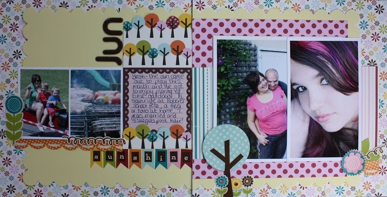
When was the last time you created a double layout? A few years back they use to be quite fashionable in the scrapbooking world, but you don't see so many of them these days. I have been creating a double layout a month as part of the Project 12 challenge ran by a Candian Scrapbooking magazine. There is a double layout sketch provided each month and participants are encouraged to create a 2-pager of their favourite photos of the month. The hardest part isn't pulling a 2-page layout together, not given the sketch does the work for you, but shortlisting which photographs you will use can take a while (especially if you snap away quite frequently!)


The double sketch for June asked for just 4 photographs - a real challenge given our family did plenty, but I'm pleased with my selection with gives a good feel for what occured in June chez the Freeman family. I used papers from my Echo Park collection pack "Walk in the Park" which even came with the bunting style stickers which worked perfectly with the sketch. The collections by Echo Park are so jammed full of product they are perfect for summer pages and make pulling together fun layouts very quick and easy!

Share with us your double pages or your Echo Park creations - we love to see what you all create.

Monday, 31 May 2010

Focus On Multi Photo Layouts - Part 3: Photo Clusters

Welcome to part three of our focus on Multi Photo layouts. This time we are looking at the photo cluster, I guess you would say it was the middle ground in Multi Photo Layouts, not clear and reginmented like the grid system but not extreme hack your photos and layer them within an inch of their life style like a full on collage!

Again the beauty of this, like any other multi photo layout, is the ability to tell more of a story than in a single photo layout. Photo cluster layouts can work with any number of photos from 3 upwards. All of the examples below use 3 or 4 photos but I vividly remember a layout Debbie has using lots of photos in a cluster - hopefully I will get her to post it.

The key to successfully clustering photos is to think about the relationship between the images both in terms of the subject and the physical characteristics of the image. Then play about with your composition - STEP AWAY FROM THE ADHESIVE! It is much better to take your time and try out different arrangements until your are happy with your cluster.

Ususally you will want your main photo to be most prominant - you can achieve this in several ways:
  • Place it on the top layer so it is not obscured at all by any other photo
  • If matting your photos mat the main photo in a different way \ colour (see the Blue Twits layout above where the photo of Izzy is mounted on the pale blue coloured cardstock where all the others have a white border)
  • Draw attention to part of the main photo with a frame or embellishment (see below in the "Daffo Deels" layout where I added a chipboard frame to highlight part of the picture.)
  • Size matters - you can make one of your photos stand out by making it larger than the others in the group. (see Daffo Deels and 1st Hair Cut)
In the two layouts below; 1st Hair Cut and Fibbonacci Sequins, I wanted to use 3 photos but felt that the cluster became to angular for the feel I wanted. To break up the straight lines and corners I made one of the photos in each layout a circular one. This softened the edges and served as a great way to draw the eye to a details. Because I only had two pictures from the first hair cut I used a second copy of one of them and punched the circle with her face in and added the bling circle to it to make an accent.


Wednesday, 26 May 2010

Mulitple Photo Layouts - Part 2

Continuing on from the blog post yesterday I find that when creating multiple photo layouts (and I do create quite a few!) I tend to follow a grid pattern. This is a neat way of sharing several photographs on the same page without getting overwhelmed with where to place everything to ensure your page looks balanced. The photographs tend to be the same size when using this method, but that doesn't need to be the case. The sketch below is based on my layout for the ATDML April gallery but as you can see from the second sketch this can be quickly altered to accomodate varied size photographs, which allow to to scrap plenty of photographs but showcase a favourite all on the same page.


When using the grid basis for your multi-photo layout, the grid does not need to take up the entire page. My layout below, Nine from '09, features multiple photographs which only occupy the top third of the page, leaving the remainder of the space free for some serious journalling, or in my case, to leave the scrummy flocked Chatterbox paper showing!!


Photo editing software is a good way of "cheating" the grid method too, especially if you are anxious that your photos/square won't quite be the same size. Picasa (available as a free download from Google) has a functionality that allows you to produce a grid collage of a selection of your photographs very, very easily. I used this in my layout below where what appears to be a 4x5 grid of photographs is actually an A4 page printed in one go having created the collage in Picasa first - instant same sized images! The layout then falls together very quickly adding a title, journalling and a few embellishments.


I'll leave you with a couple more grid-inspired layouts and we'll be back with more multi-photo inspiration soon!


Tuesday, 25 May 2010

Focus On Multi Photo Layouts - Part 1: Photo Collage

When we run our retreats classes that are multi photo layouts are always popular. It seems that many of us have sets of photos which we want to scrap but where either there is no single standout photo that can carry a whole layout, or there are many photos we want to include. So I thought here on the blog we would do a little series of pieces on Multi Photo Layouts. Hopefully the DT might chip in with a few of theirs and some tips as well (I just thought of that bit as I typed so I need to ask them about that!)

First up is the Photo Collage. I find this is a good way to use potentially a large number of photos where none of them is great but as a collection they capture an event of idea. It could be a holiday, a person, a feeling - it is very versatile.


This isn't a new layout but it is one I wanted to share on here. I taught this at a retreat in 2009 and I was inspired to do it when I was sorting through an old box of stuff I had saved from my teenage years.

My friends and I used to enjoy making a photo collage using pictures of each other and places we had been. A couple of months before I started making this Elizabeth, my cousin and, at the time, our lodger asked me to help her make a photo collage of her holiday the previous summer. We spread out loads of photos on the floor and played about chopping them up, cutting people out of them and creating a collage. It was about then that I remembered how much fun it was and decided to do a layout using the same technique.

The photos in my layout are a mixture of pictures of our old house and our new house and I also cut out photos of Darren and the girls (I am on there but only a tiny pic of me in front of our old front door!)

When using this technique I find that cutting out some people or images allows you to cover the straight edge joins between some of the photos giving a more fluid effect with photos linking into each other rather than having abrupt lines where they meet. For this layout I changed them all to black and white as I wanted it to be quite a cohesive background although sometimes a riot of colour is fun!