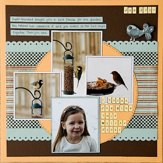
Again the beauty of this, like any other multi photo layout, is the ability to tell more of a story than in a single photo layout. Photo cluster layouts can work with any number of photos from 3 upwards. All of the examples below use 3 or 4 photos but I vividly remember a layout Debbie has using lots of photos in a cluster - hopefully I will get her to post it.
 The key to successfully clustering photos is to think about the relationship between the images both in terms of the subject and the physical characteristics of the image. Then play about with your composition - STEP AWAY FROM THE ADHESIVE! It is much better to take your time and try out different arrangements until your are happy with your cluster.
Ususally you will want your main photo to be most prominant - you can achieve this in several ways:
- Place it on the top layer so it is not obscured at all by any other photo
- If matting your photos mat the main photo in a different way \ colour (see the Blue Twits layout above where the photo of Izzy is mounted on the pale blue coloured cardstock where all the others have a white border)
- Draw attention to part of the main photo with a frame or embellishment (see below in the "Daffo Deels" layout where I added a chipboard frame to highlight part of the picture.)
- Size matters - you can make one of your photos stand out by making it larger than the others in the group. (see Daffo Deels and 1st Hair Cut)
In the two layouts below; 1st Hair Cut and Fibbonacci Sequins, I wanted to use 3 photos but felt that the cluster became to angular for the feel I wanted. To break up the straight lines and corners I made one of the photos in each layout a circular one. This softened the edges and served as a great way to draw the eye to a details. Because I only had two pictures from the first hair cut I used a second copy of one of them and punched the circle with her face in and added the bling circle to it to make an accent.


