Monday 30 March 2020

Outside inside

Hello campers 

I hope you are all keeping well in these strange times.

This week I've been using Heidi Swapps Storyline range to create pages feature outdoor photos from home and away.


The range includes the lovely 'Lost' paper which is a grid map of New York.  I have been meaning to scrap this cracking skyline shot I took while I was at a food market in Williamsburg.  I wanted to use the map paper with a twist so I cut 5 sections of the paper in various lengths and widths.  

I added in some sections and strips from the "Daily Dose' and 'Sunnyside' papers and laid in a a skyline formation across the page.  I rounded the top corners of some of the strips and over unlaid the strips for variety.  I chose the weekdays strip but used the friday - monday sections as we were there for a long weekend.


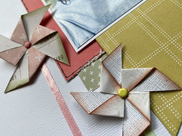
I mounted the photo onto the pink side of 'Daily dose' and positioned in place with foam pads.  I cut and rounded the top corner of the tag from the 'weekender' paper and layered just to the right of the photo.


I added my title using these fab shiny 'Cinnamon' thickers with a little red heart as I nod to the I love new york t shirts.  I used some spare dots to add accents to the skyscrapers.  I also used thickers from the 'Wander' range to add in some arrows and map pins.  


As a final touch I added some white lines to the left of the skyscrapers - I wanted to give a nod towards the stylised art deco feel of the empire state building.


The second layout was based around some photos a little closer to home.  Luckily for us we have a Ghost town near us and in the run up to isolation being implemented we took the opportunity to use the remote nature to get some much needed exercise.  


I loved the smooshy painty effect of 'Market fresh' and it definitely was a good match for these pictures of me getting stuck in the mud :)


I partially mounted my photo onto the pink side of 'Daily dose and then used the coloured tag section from the other side of "Daily dose' to complete the mount.   

 I then cut the ledger paper and lime green floral bordered section from 'weekender' and then mounted as below.  I also cut the grey lined sections and cut down to just the lined part of it. As a nod to the town part of our walk I cut a circle from the 'Lost' paper.  There is a circle mapped ou but a large mug or circle cutter will do the job.


I arranged the photos, mats, journal spot and title spot in place and added the title - I used thickers 'Apartment' in Coffee 


For a final touch to the outdoors I cut the flowers from 'Weekender' and shaped them to create a bit of texture.  I then attached them using a mixture of double sided and foam pads.


Don't forget if you do your version of any of of our layouts don't forget to pop it into our Facebook gallery for the chance to win a prize!!

Saturday 28 March 2020

Let's go with Heidi Swapp Storyline

Morning scrappy friends.


I've been playing with Heidi Swapp Storyline which is a great and versatile collection. I made this page with it and printed multiple photos each of which I made a hand drawn frame for on some scrap white card.


The rest of the page was just some 12" horizontal strips with faux stitching added, quick and easy!

Sunday 22 March 2020

March Virtual Crop Class 3 with Mel

Hello and welcome to the last of our March Virtual Crop classes. I hope you have enjoyed the two classes earlier from Ann and Tricia.

For this class I worked with the beautiful Cocoa Vanilla Wild at Heart. I made three layouts with the kit and thoroughly enjoyed using this range to show case some fun summery photos.


Do come over to the ATDML # Create Facebook page to share what you have been working on.

Next month we will have a very special bumper Virtual Crop with SIX classes and kits will be on sale earlier than usual so please do keep an eye on our facebook page for info on that.

March Virtual Crop Class 2 with Tricia

Good Morning Campers 

Welcome to the 2nd class of today's Cyber crop, where I'll be using Aryia's Garden by Bo Bunny.  This range is full of sunset colours and natural finishes to lead us into spring.  

For the first layout I used inspiration from the garden elements and the Mondrian-style element included on one of the papers to inspire the layout.  


I loved the wooden elements of these papers and although they would be perfect for country or beach pages I chose to team them with an urban setting with triangles and cutting criss-crosses.  I also used the waste of the alphabets for an edgy stencil/graffiti feel.


To finish off I wanted to make the most of those golden and pink shades in a fun poppy way. By blending a variety of circles with graduating colours I used the papers to showcase an early morning sunrise. This page would work well for beach pages or just kicking back with a drink in the garden. I also wanted to challenge myself to incorporate numbers into my title so decided to freeze time and use the time of day the photo was taken at. Instructions for the layouts are here


I hope you have enjoyed doing this class today and don't forget to pop back for the next class at 2pm with Mel.

Have a great day!

March Virtual Crop Class 1 with Ann


Welcome to this months virtual crop and I have created no less than four pages with the gorgeous Indigo & Ivy papers the instructions for this can be found HERE and run to less than a page for each of the layouts. Plenty to keep you occupied this Mothers Day and plenty of options to change things up if you desire.


You should also also be able to create similar pages wih your own stash if you didn't manage to grab the kit, just use the layouts as a guide.


Have a lovely day all whatever you are doing, even if it isn't what you originally had planned. Stay safe and keep smiling x

Friday 13 March 2020

Storyline


Hi everyone - Dolly here with a few pages I have made playing with Heidi Swapp Storyline Chapters. The colours int his range are just so lush - gorgeous pastel pinks and greens and greys and I love them. And there are great journalling and title blocks too.


 The colours work well on Kraft or white or coloured backgrounds which makes the papers really versatile.


I had fun with this one making some pinwheels - I haven't done that for a very very long time.


I think they are also really versatile papers so - go ahead, have a look in store and see what you come up with.

We would love to see your pages in our facebook group.


Sunday 1 March 2020

Weaving and verticle titles.


Good afternoon campers!!

This month I've been playing with Dear Lizzie's Here and Now collection.  Full of bright summery collection focuses on those days that memories are made of.  

I loved the colours of Fun and sun,  Free spirit, Hot hot hot and Heatwave as they reminded me of the colours of the peace doves and cranes I saw when visiting Hiroshima.  I like the idea of creating a woven look to give a construction paper look.  


I cut 8 slits into the paper 10" long and leaving an inch at the top and bottom of the page.  These were 1cm apart to leave room for weaving.  I then cut strips of paper 1cm wide and wove into an arrow shape by taking the paper under and over as below leaving the tails long but even at the end.  I trimmed off the excess.


I used the blue/green sections of Sun and Fun to create my Journalling spot as below.


I used the title strips to at the left hand end of the page and also to hide the last slit as the original image as below and then chose alternate colours of these Thickers to create the title.  I then used the remaining pink section of Sun and Fun to create pennant mats for my photos and applied.


I started my using the remaining section of Hot hot hot and cutting along the patter to create a section like below as the basis. 


 I used a section of the flowers and cactus from the remaining section of hot hot hot and Sunshine feeling to create a sweep across the page.  I used a complete strip using the title strip and two rows of Sunshine feeling cutting along the triangles on the outside edge and used these to accent the right hand side of the page.


 I used some silver thickers to create a flowing title adding adding brackets to give the feeling of the movement of the butterfly's wings.  To finish I added a mix of enamel dots and relief paints to create a falling motion down the page. The bottom left hand corner has been left free to add some journalling and dates.