Wednesday, 28 February 2018

Kaisercraft Documented mini book


Hey scrappy friends, its Ann here today.
Loved, loved, loved the new Kaisercraft Documented collection which is a school themed set that includes stationery themed pages, maps, ledgers, locker doors, alphabets and more. The neutral colours also mean that no matter the colour of your child's school uniform they are going to work, so I made a cute mini book to house school photos of my youngest who is soon to leave Primary school (where did the years go!!).

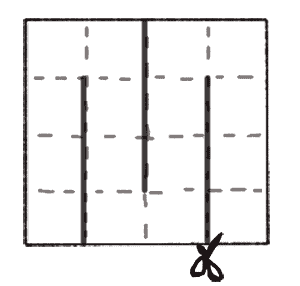
I made this little mini book (sometimes called a maze book) from one sheet of white 12x12 card (you can use any colour) which is scored at 3",6" and 9", then rotated round 90 degrees and scored again at 3", 6" and 9". This gives you a set of 16 squares, each 3" x 3". You then score the dotty lines and cut the solid lines as illustrated below.
I'm sure several of you will have made these before, they aren't new but worthy of resurrecting every now and then for a cute minibook format. Once you have your piece prepared as above you folder along the score lines in alternative ways, so fold under the first score line and over the second and keep repeating until the end. This makes a stack of 3" square pages which when you manipulate round in your hand you find a way that works to open like a book and figure out which pieces to stick down back to back to make pages, and some which can be left open at the top to make pockets.

I then made a cover to wrap around the outside from black card. and decorated my pages with the lovely papers. This book was perfect for an introduction page and then 7 pairs of pages to showcase primary school photos from reception through to year 6. 

Adding stamping and washi tapes gives more interest but as flat embellishments these don't add bulk to your little book which would otherwise be tough to close! Worth mentioning that these papers don't just have to be used for school themed projects - they are versatile enough for other subjects and I have used the map paper for a travel pages and pieces from all of them for a graduation photo layout.


More images of pages can be found in the February ATDML gallery along with more inspiration using Kaisercraft latest releases from the team.

Monday, 26 February 2018

A little bit of Summer with Kaisercraft


As it gets a little chilly here is a reminder of summer with the beautiful Beach Shack collection from Kaisercraft.  There are loads of natural textures and some beautiful soft watercolours, and a whole load of fantastic sentiments in this collection

I started my page with some tearing using a paper called Thatched and then adding in some brown mesh.  To add a watery effect around the photo I used my distress oxides and broken china and a little tea die with a watercolour brush and added some flicks and just built up the colour.  I found a few phrases on the paper Wave Break (it is packed with lovely words), then added some wood veneers and a few stickers from the collection.

I tore my layers and then sandwiched some mesh inbetween.


Here you can see some of the colour and the little flicks of brown too.

I hope you all stay warm this week!

Thursday, 22 February 2018

February Sketch Challenge


Hello, hello - Karen here with the February Sketch Challenge.

This is the sketch I have chosen this month .


And this is how I interpreted it.


I would love to see your take on the sketch so please post them on our Facebook page.

Wednesday, 21 February 2018

Simple Stories Romance Layout

Hello all, I have had a little time to actually play with some paper and create some layouts that are not classes for the Virtual Crop or retreat so thought I would share what I have been up to!

I opened up my collection pack from the Simple Stories Romance range and I have to say I have been particularly keen to use this gorgeous heart on a whitewashed wall paper but I couldn't quite bring myself to use it yet... sometime soon I will I'm sure (just need to stroke it some more first!)


I actually used a piece of white cardstock and several of the stickers with just a snippet from one of the papers to add some colour to the top and bottom and one of the 4x4 cards to mat my photo.


I loved this photo with this collection as the pinks and greens just worked perfectly. I doodled the outline of two semi circles on the left and right of the page. I wanted to avoid everything being too central so used the two parts of the banner to arrange where to place my photo.

With a little washi tape, some lettering and a lace paper tape strip everything came together very quickly and easily for a straight forward simple layout ready to go in my album.

Saturday, 17 February 2018

February Virtual Crop Class 3 with Katherine

Hello and welcome to my class, I hope you enjoy it.  We are using the Hazy Days papers from 7 dots.  There are elements of mixed media, so if you fancy getting out your distress stains and some white paint and getting a little bit inky then do, if not you can adapt it to avoid the painty elements!

Both pages are quick to put together, even with the paint drying time!


Here is my first page which is really straightforward as the papers are so beautiful.  A little bit of paint and some distress stain splatters.


My next page uses more inking and lots of layered strips in a multi-photo page.  There is no paint in this one, but don't let that stop you adding some!


February Virtual Crop Class 2 with Tricia

Welcome to my class - I hope you have your scissors at the ready!!

I'm using Bo bunny 'Sweet moments' range to create layouts with a little bit of fussy cutting but once done are easy to assemble. The range has equal amounts of sugary pink and fresh greens which work brilliantly together or apart.


The first layout involves creating your own elements by layering sections of cut out floral elements to create a 3D effect without mountains of foam pads. 


And grab your glossy accents for the 2nd layout to add a bit of shine to these gorgeous chrysanthemums.


Click Here to download the full PDF instructions

Don't forget to come back at 2 o'clock for Katherine's class.

Happy Scrapping - and please share your creations over on the ATDML # Create Facebook group.

February Virtual Crop - Class 1 with Mel

Good morning and welcome to the first class of today's Virtual Crop. I have created two layouts with the Simple Stories Psoh collection. In the cold grey days of February I really enjoyed the beautiful spring like pastel colours of this range.

Here's one of the layouts I created:


Click Here to download the full PDF instructions and to see the other layout.

Don't forget to come back at 12 o'clock for Tricias class.

Happy Scrapping - and please share your creations over on the ATDML # Create Facebook group.

Friday, 16 February 2018

February Virtual crop challenge

Welcome back to another Mood Board inspiration challenge ahead of your February Virtual Crop day tomorrow.

This month the mood board colours are shades of blues accented with brown. There are lots of hearts in the images including book print ones, plus a doiley, a suitcase (so maybe travel inspiration there?), plus trees/bark (outdoors), frames... lots to take your inspiration from.


I used this board to inspire the following page with a woodgrain background inspired by the trees, hearts, the colours and a doiley as well as book print leaves.


I hope you will join in this challenge. Take a look here at last month's if you missed it as well. These are a great way of kick starting your creative process and it is really interesting to see where the same board takes different people. Share your pages in our Facebook group Mood Board gallery adding the month and your name so we can give credit where due and share our favourites ahead of next month's virtual crop.

See you back here tomorrow at 10am for your first February Virtual crop class.

Wednesday, 14 February 2018

February 2018 Virtual Crop Photo Requirements

Hi, Here are the photo requirements for this months Virtual Crop.  Remember that it all starts on Friday night, here, with the challenge and then the classes start at 10am on Saturday.  Come and join in the chatter in our Facebook group ATDML #Create and share your pages.  If you didn't manage to get the kits then play along with your own papers.

Class 1 with Mel

Layout 1 - 6 by 4" landscape
Layout 2 - 6 by 4" portrait

Class 2 with Tricia

Layout 1 - 4" square
Layout 2 - 4" square


Class 3 with Katherine

Layout 1 - 7 by 5" portrait (though it could easily be a 6 by 4")
Layout 2 - three 3 by 4" portrait photos

Good to have are brown ink, white paint or gesso and an old store card, distress stains in colours that go with your photos.

All the chatter and challenges will start here on Friday night, and all the classes are posted here and will be up on the shop website for you to use too.

Friday, 9 February 2018

Scraplift Challenge - February 2018


Hello again.  This time I am here with my Scraplift of the month.  I have chosen this layout by Katherine.


Katherine Sutton - Fall in love with

I used the Miss Betty range from Kaisercraft - just goes to show you can use a predominantly feminine paper for a male layout.   I distressed the edge of my background paper, added some white acrylic behind the photo and the cluster at the bottom, have used spotty paper and I found a piece of beaded wire to frame my photo - as Katherine did.


I also added gauze behind my photo (very Katherinesque) and used some stickers behind the torn places and around my photo as it was too minimalist for me to be happy with.

I hope you join in our Scraplift Challenge - all you need to do is to choose a page from the January 2018 gallery, which can be found on the ATDML shop site, on the right under Information.  If you make a layout please share it on our Facebook page. 

Wednesday, 7 February 2018

Faviourite Layouts from January 2018


Hello Lovlies

How are you liking this cold weather?  Not much I suspect.   Why not grab a warm drink and have a look at my three favourite layouts from the January Gallery?

First up is one from Ann

Tis The Season


I really like how she has combined the two different papers, her journaling on little rectangles and the little cluster of embellishments on the bottom left of her photo.

Next is Katherine's Fall In Love With


What's not to love about this page - The multiple layers, the painted areas, the beaded wire, the cluster of embellishments at the bottom left of the page - in fact all if it is gorgeous.

Finally, my favourite from me

Snow Much Fun


I chose this one because I pushed myself to find different ways to use the foiled vellum, as a photo mount, as backfill to the title and a squares behind the bottom panel.

There are plenty of other layouts in the January Gallery, which can be found on the ATDML shop site under information,  so why not pop on over there to have a look.

Sunday, 4 February 2018

Journaling Prompts - February

Welcome to our February Journaling prompts. I hope you all found last month's prompt to be useful! This month our prompt is:

Create a frame around your page with journaling.

Below are some of my examples, remember to upload your layouts to the Journaling Prompt gallery over on the ATDML # Create Facebook page.

This layout was based on a class Ann taught at one of the ATDML retreats and I love how the journaling is interupted by the splats and embellishment clusters but still forms a great frame to contain the photo and other page elements.