Sunday, 3 March 2013

Banners

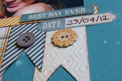
Back in October Katherine share a blog post as part of Trends on Tuesdays all about banners and it seems the trend is still popular among scrapbookers, and certainly the design team. From using large strips of paper cut into banners as the focal point of your page, to smaller banner pieces tucked on a page or even a bunting line of banners they are everywhere. The design team gallery for February saw many examples of this.


Karen's beautiful layout sees the banner pieces cut from a variety of coordinating pattern papers (great way to use up those little pieces you have remaining).


Edges have been inked and each banner piece slightly overlaps the next.


Katherine's I love U2 layout sees the banner pieces form her photo mount, with ink and paint and distressing softening their appearance against the background.


Distressing and inking the edges to your banner pieces can help to hide where they are not quite  symmetrical and evenly cut (as we all know they never look straight not matter how much we measure!)

Have a go at a banner inspired card or layout yourself  and be sure to share your pages by leaving a comment and link below. 

Friday, 1 March 2013

Tag Team

Looking through the design team gallery for February, full of projects using luscious My Minds Eye products I noticed that both Karen and I had created layouts featuring tag shapes.


My brand new year layout features 4 tags with two placed end to end to make a longer strip to the right of the page. I simply cut rectangles from card, snipped the corners off to make a tag shape and added a punched brown circle of card with a small hole punched in the centre. Decorating these 4 tags with papers and running titles and journalling that overlap the tags and background card leads to a simple design idea creating a layout that flows across the page.
The Honeycomb Red/Pink double sided paper I have used can be found HERE, and the glittery striped paper/brown on reverse HERE.


Karen's Sweet Treat layout also uses 4 tags placed in a line across the page. Three act as photo mounts and the third is filled with hand cut embellishments and a title. She then sneaks a 5th tag in turned on it's side for the journalling. The floral embellishments Karen has used are from this paper HERE and this paper was also used on the layouts taught by Debbie at Ecelectic Keepsakes crop that several of the design team shared.


Finally this page by Katherine features a decorated  tag to the left of her photo housing the title to her layout.

Come back over the weekend when we share banner shapes appearing on more February DT layouts, but if you can't wait why not visit the full gallery HERE.

Tuesday, 26 February 2013

Trends on Tuesday - Roller Stamps


One of the new products from CHA that caught my eye was Glitz's roller doodle stamps - I know roller stamps have been around for ages, but somehow I missed having a go with them!  The stamps come in 2 sizes a large and tiny, I decided to have a go with the tiny camera roller and the larger chevron roller.  

For my page I tried to use them in a few different ways - a quick roll down the edge of a strip of paper with the camera  one, but I also used it to make my own camera embellishment using it to make a camera backing paper for the wood veneer. 

 I covered my chevron roller with yellow ink to make an arrow feature and then also used it across the top of the page with black ink....which is where I noticed it makes a really nice fade effect, a bit ombreish, so I had a go with this on a card.


I used red, orange and yellow ink to make this faded background for my card.  I inked the roller and then did one stripe which comes out the darkest and just keep rolling without re-inking the stamp, then switch to a lighter colour and do the same so you get a nice fade.

They are really easy to use, I did ink them with both large and small ink pads....but obviously the larger ink pads are a lot easier to ink them with!  Also I love the designs so I can see myself adding more to my collection!

Friday, 22 February 2013

A Place in Time - February

Well,so far so good! If you remember this post I decided to make a page a month with the lovely papers from Graphic 45. 
I love the way there are so many elements on the sheets you can cut out and use - I've slipped a little tag with some hidden journalling under the photo and punched some hearts with leftovers from the papers
You can buy the whole range of these here AND there are some fab new ranges in recently too- including these lovely little wood embellishments.It's not one of the clearest photos of us but I love it as it captured a moment.

Here it is,hope you like it.


Thursday, 21 February 2013

Notes From Stitches

On Sunday we went for a day trip to Birmingham NEC for Stitches trade show. We had already placed the majority of our orders either direct with manufacturers or with distributors since CHA however it is always nice to get an up close look at some of the products on offer and also to see what's new or interesting.

I forgot my camera but took a few snaps with my phone.

In terms of scrapbooking things we saw some Bo Bunny, some Fancy Pants and some Carta Bella which we didn't already have on order but will order now. Also some of the things which didn't look so good in the manufacturers previews were much nicer in real life :)
 

Of course it is lovely to wander round the show and admire all the lovely samples - the Paperartsy stand didn't disappoint with an array of beautiful samples.

 
And of course there are always those that go the extra mile - for example this car which was being decorated in decopatch!!!


 Sorry there are not more photos, can't believe I forgot the camera! I also picked up some make & take ideas for the retreat :)

Keep an eye out for more products arriving in store over the coming weeks as the CHA and Stitches orders come in.

Tuesday, 19 February 2013

Denise's Story of Us

I loved Debbie's choice of papers and colours for her class at the Eclectic Keepsakes crop.My Mind's Eye is always a favourite of mine. I stayed  pretty close to Debbie's layout and the cutting out was right up my street as I love to sit and snip away! Here's my version- I changed the background to a bluey one as It seemed to go a bit better with the snowy theme.
I hope you enjoyed looking at our versions of Debbie's lovely class.

Monday, 18 February 2013

Mels Version of "Story Of Us"

I really loved Debbies LO and it was once again good to be a bit more inventive with papers which would not usually be my style, I find them beautiful individually but would not usually use so many busy patterns together.

I took Debbies design and amended it to suit the photos I had. I was a late booking and originally thought there would not be enough kits ofr me to have one so I didn't prepare photos. I ended up using a single 5x5 photo instead of the two on Debbies LO. I also wanted to offset my circles rather than keep them equal but as ever it was wonderful to take a class packed full of inspiration but also know that the teacher would not freak out if a little freestyling went on!

My photo was of the kids and the dog so I didn't feel "The Story OF Us" would work as a title but I liked the die cut so positionned it so only "The Story" was visible.


I am NOT a patient hand cutter and found it a chore to cut out all those flowers. In the end I was going to give up and go more minimal but my lovely friend Debs stepped in and cut me a few more while I was assembling the layout so it would have been rude (and daft) not to use them!


Hope you have enjoyed seeing our individual takes on Debbies class - I think Denise also did the class and I expect she will share her creation at some point too!