Showing posts with label Focus On. Show all posts

Thursday, 5 May 2011

Prima Melody

I thought I'd share with you some layouts I made with the Melody range by Prima (available in the shop here).

Initially I was overwhelmed by the very busy patterned papers - and that's from someone who loves patterned paper! I figured if I found them daunting then there would be others out there that felt the same, so I wanted to give you an insight into how I overcame that 'eek' feeling and got down to using the papers as opposed to just drooling over their gorgeousness!

I broke myself in gently, so to speak, by using the least busy of the selection and then building up the interest by adding the Cosmic Shimmer spray inks (Mallow Blush and Bronze Blush) over a Prima mask. Then I added balance to the right hand side by cutting up one of the notepapers and tucking them under the photo. I absolutely love using this type of die cut; I think they make a great base for layering titles and embellishments as well as giving a beautiful space for journaling.


The Tim Holtz ornate label frame is the perfect spot for holding my sub title and I've added a range of embellishments around the page to help move the eye across each section.


Next up I thought I would jump in feet first and use a whole range of the patterned papers together. Using a blocked design, or strips as I have here, is an easy way to get a multitude of patterns onto one page -using the tone on tone or more subtle patterns next to the bolder patterns, and making sure that there is a good contrast between each stripe, helps each pattern to stand out in it's own right rather than them all merging together in a confusing pattern jungle. Because there are SO many patterned papers on the background, the embellishing was kept much more low key and the story showcased on the paler journaling block


Finally, I went all out with this absolutely gorgeous, but incredibly busy, patterned paper. A clustered design works well when using a busy background as it provides a strong focal point. The stronger colours and less busy patterns of the paper strips under the photos are a perfect way to 'ground' the cluster and matting the photos gives a little bit of vital white space between them and the background.


I used various dies and punches for my butterflies - using the same patterned paper for all three as well as the paper strip running across the bottom helps to unify the key elements. And I love the new Sugar Blooms flowers Prima have released. They are beautiful yet small enough to add interest to other embellishments without overwhelming them.


I really do love patterned paper backgrounds - if you have shied away from them in the past, I hope that my examples and tips encourage you to spread your wings a little.



Tuesday, 17 August 2010

Frame It!

In todays post we wanted to show some different ways you can highlight your photos using frames created in various ways.

Below are three layouts that feature a different type of frame to add interest and draw the focus to the photo or photos.

"Summertime"
The layout above features a chipboard frame which has been painted and given an aged wood effect. I started by painting the whole frame with a green base colour. Then, using the edge of a scrap of cardstock dipped in brown paint I added diagonal lines in the corners of the frame to look like mitre joins. Add further lines of brown paint with the edge of the card to look like grooves in painted wood. Finally finish by inking the edges with brown ink and aging the whole frame by applying chalk ink to the dried painted surface to grubby it up a little.

"Olivia - Growing and Changing"
In this layout again I used a plain chipboard frame. To jazz it up a little I embossed the whole frame with American Crafts Copper Glitter Zing! Start by applying a clear ink such as Versamark Watermark ink. For the more awkward areas to ink I used the Versamark Watermark pen which makes it easier to get into the corners. Then over a folded piece of clean paper I applied a liberal amount of the embossing powder so it covered the whole frame. I carefully removed the frame and placed it on a heat proof mat and used the folded paper to tip the excess embossing powder back into the pot. Then, using my heat buddy heat gun I embossed the frame to give the lovely copper glitter effect.

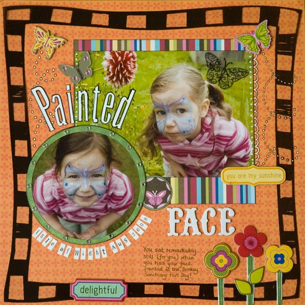
"Painted Face"

This is one of my favourite layouts, I just loved the zingy colours and it was fun to do. This was the easiest of all the frames shown as it is a pre made acetate frame cut to size. However you could create a similar frame with a piece of plain acetate and a slick writer. To make the frame feel part of the layout rather than a last minute after thought I overlapped embellishments onto the frame and when doodling the dots to illustrate the path of the butterfly I drew them to look like it had flown around the frame.

Monday, 9 August 2010

Journaling - Love Your Handwiriting?!

Follwoing on from my post on the 3rd about making journaling a focus on your layouts i wanted to talk about that age old debate... to use your writing or not to.

Now I will hold my hands up and say that i have always thought my handwriting is ok, not great but ok. So in many ways I can't really empathise with those of you who hate your handwriting however I am still going to try to persuade you to use your handwriting, even if it is only in small amounts or only on some of your layouts.

These two photographs are the main pieces of evidence I am going to use in my case for using your handwriting. Photograph one is a photo of me on my wedding day in 2002 with my Gran, the second photo is a page from the guest book we had at our wedding. Two of my ushers went round and took a polaroid photo fo the guests and the photo was added to the book there and then and the guests wrote their comments next to them.


My Gran died in January 2003 so 6 months after my wedding. We were very close and as always when you lose someone close to you it is a time of great sadness. When we were sorting through Grans things we all took some small items that held precious memories but even now, 7 years on, this little piece of handwriting in a book seems like so much more of a tangible connection than an ornament or other keepsake.

Your handwriting is so personal to you that even if you don't like it, it is as much a part of you as your physical appearance and your personality.

In much the same way as I hear people say they can't have photos of themselves in their albums because they don't like photos of themself, we commonly hear, "I don't like my handwriting in my albums as it is not nice enough." But like it or not it is a part of you - and one that will remain when you are no longer here. So morbid though it sounds adding your own handwriting adds a little bit of you as a personal legacy for those who will look at your albums when you are gone.

I hope that one day my children enjoy the handwritten comments as much as I love that single entry in my guest book from my wonderful Gran.

Tuesday, 3 August 2010

More journalling focused pages

Having read through Mel's post yesterday I wanted to share my thoughts on journalling. I've been scrapbooking for almost six years now and when I look back on my earlier layouts I have done I smile as the photographs re-ignite the memories and I am able to recall the stories behind them, but I didnt always write them down (thought my handwriting would ruin my page!), sometimes I didn't even date my pages to be able to know when the photographs were taken. Recently whilst at my parents we were looking over some old photographs of my grandfathers and every one had a place and date on the back! EVERY ONE! I am so proud to have called that man my grandfather, I treasured seeing his scrawl telling me what I would otherwise not have known.
When I look at my layouts now, I have journalling on almost all of them, at the very least dates and names. Sometime I go into more detail with my story, othertimes not. Here are a couple of pages from me where I journalled more than average. I hope, along with Mel, that you will be inspired to make journalling the focus on a layout you create in the near future.


Monday, 2 August 2010

Journaling - Making It The Focus Of Your Layout

Our approach to journaling has, I think, a lot to do with what our reasons are for scrapbooking. For some they scrap to record memories, for others it is creative therapy and for others it is a chance ot make something pretty.

If you fall into the first two categories your desire to journal is likely to be stronger however all too often we crete a page and then work out wha we will journal and where we can fit it; it becomes the final addition, an after thought.

The two layouts below were examples I used in a class I taught about making the journaling the focus of your layout and using it as a feature rather than added around the other elements.

We discussed ways of making the journaling more interesting. For example by combining hand written journaling with key words added using stickers or stamps.

This layout uses entirely hand written journaling. It isn't perfect, some of the text flow is broken up by the central circle and photo however I love the layout and the effect I got with such a large amount of hand written journaling. To add interest and a little humour I included some little simple child like doodles such as the little boat and the waves.
I hope this has been of interest and maybe will inspire you to really put the focus on the journaling for some of your layouts.

Monday, 31 May 2010

Focus On Multi Photo Layouts - Part 3: Photo Clusters

Welcome to part three of our focus on Multi Photo layouts. This time we are looking at the photo cluster, I guess you would say it was the middle ground in Multi Photo Layouts, not clear and reginmented like the grid system but not extreme hack your photos and layer them within an inch of their life style like a full on collage!

Again the beauty of this, like any other multi photo layout, is the ability to tell more of a story than in a single photo layout. Photo cluster layouts can work with any number of photos from 3 upwards. All of the examples below use 3 or 4 photos but I vividly remember a layout Debbie has using lots of photos in a cluster - hopefully I will get her to post it.

The key to successfully clustering photos is to think about the relationship between the images both in terms of the subject and the physical characteristics of the image. Then play about with your composition - STEP AWAY FROM THE ADHESIVE! It is much better to take your time and try out different arrangements until your are happy with your cluster.

Ususally you will want your main photo to be most prominant - you can achieve this in several ways:
  • Place it on the top layer so it is not obscured at all by any other photo
  • If matting your photos mat the main photo in a different way \ colour (see the Blue Twits layout above where the photo of Izzy is mounted on the pale blue coloured cardstock where all the others have a white border)
  • Draw attention to part of the main photo with a frame or embellishment (see below in the "Daffo Deels" layout where I added a chipboard frame to highlight part of the picture.)
  • Size matters - you can make one of your photos stand out by making it larger than the others in the group. (see Daffo Deels and 1st Hair Cut)
In the two layouts below; 1st Hair Cut and Fibbonacci Sequins, I wanted to use 3 photos but felt that the cluster became to angular for the feel I wanted. To break up the straight lines and corners I made one of the photos in each layout a circular one. This softened the edges and served as a great way to draw the eye to a details. Because I only had two pictures from the first hair cut I used a second copy of one of them and punched the circle with her face in and added the bling circle to it to make an accent.


Wednesday, 26 May 2010

Mulitple Photo Layouts - Part 2

Continuing on from the blog post yesterday I find that when creating multiple photo layouts (and I do create quite a few!) I tend to follow a grid pattern. This is a neat way of sharing several photographs on the same page without getting overwhelmed with where to place everything to ensure your page looks balanced. The photographs tend to be the same size when using this method, but that doesn't need to be the case. The sketch below is based on my layout for the ATDML April gallery but as you can see from the second sketch this can be quickly altered to accomodate varied size photographs, which allow to to scrap plenty of photographs but showcase a favourite all on the same page.


When using the grid basis for your multi-photo layout, the grid does not need to take up the entire page. My layout below, Nine from '09, features multiple photographs which only occupy the top third of the page, leaving the remainder of the space free for some serious journalling, or in my case, to leave the scrummy flocked Chatterbox paper showing!!


Photo editing software is a good way of "cheating" the grid method too, especially if you are anxious that your photos/square won't quite be the same size. Picasa (available as a free download from Google) has a functionality that allows you to produce a grid collage of a selection of your photographs very, very easily. I used this in my layout below where what appears to be a 4x5 grid of photographs is actually an A4 page printed in one go having created the collage in Picasa first - instant same sized images! The layout then falls together very quickly adding a title, journalling and a few embellishments.


I'll leave you with a couple more grid-inspired layouts and we'll be back with more multi-photo inspiration soon!


Tuesday, 25 May 2010

Focus On Multi Photo Layouts - Part 1: Photo Collage

When we run our retreats classes that are multi photo layouts are always popular. It seems that many of us have sets of photos which we want to scrap but where either there is no single standout photo that can carry a whole layout, or there are many photos we want to include. So I thought here on the blog we would do a little series of pieces on Multi Photo Layouts. Hopefully the DT might chip in with a few of theirs and some tips as well (I just thought of that bit as I typed so I need to ask them about that!)

First up is the Photo Collage. I find this is a good way to use potentially a large number of photos where none of them is great but as a collection they capture an event of idea. It could be a holiday, a person, a feeling - it is very versatile.


This isn't a new layout but it is one I wanted to share on here. I taught this at a retreat in 2009 and I was inspired to do it when I was sorting through an old box of stuff I had saved from my teenage years.

My friends and I used to enjoy making a photo collage using pictures of each other and places we had been. A couple of months before I started making this Elizabeth, my cousin and, at the time, our lodger asked me to help her make a photo collage of her holiday the previous summer. We spread out loads of photos on the floor and played about chopping them up, cutting people out of them and creating a collage. It was about then that I remembered how much fun it was and decided to do a layout using the same technique.

The photos in my layout are a mixture of pictures of our old house and our new house and I also cut out photos of Darren and the girls (I am on there but only a tiny pic of me in front of our old front door!)

When using this technique I find that cutting out some people or images allows you to cover the straight edge joins between some of the photos giving a more fluid effect with photos linking into each other rather than having abrupt lines where they meet. For this layout I changed them all to black and white as I wanted it to be quite a cohesive background although sometimes a riot of colour is fun!